At the start point of any architectural imaging project we think about a lot of things: What are we trying to communicate? What is the purpose of the imagery? etc. We're in the business of visual communication and marketing, so we need to think about the how to illustrate a building and it's environment in the most captivating, positive way.
Its rarely one thing that defines the building, a space, or a sense of place. Typically our brief requires an image to communicate numerous functional and aesthetic aspects of the scheme, and with impact. And why not? That should be possible, shouldn't it?
I find one of the biggest challenges we face in our work is this desire to sum up often years of design thinking and detail in a single all encompassing shot. Yet a single shot that tries to highlight and convey too many design components or ideas can easily become visually compromised, and the potential for generating an emotional response will be diluted. The more we are required to demonstrate multiple features and design details, the higher the chances the image will not succeed on an emotional level. Visualisation done in this manner can force the viewer to focus on too many things, and the image can take on the feel of a collage - fine for a student project but not for a representation of something that involves millions of pounds of commercial investment.

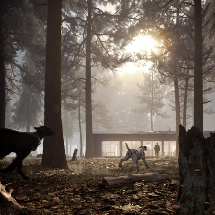
In isolation each element of an image like this may do a job or tick a box; a bright sunny day, a bustling city square, a tall tower forced into shot so we see the top but we also see foreground cafe furniture right in front of us... and the steam coming from the coffee cup... and we can see into the reception through the revolving doors… A description of an image like this becomes exhausting to read and it's equally exhausting to study and understand. It says a lot about what's going on but there's no real real focus, and all the elements fight for attention. Is the story about the what it's like to sit quietly in the square and people watch? Or is it about an amazing iconic view of the tower? An image like this will rarely deliver a meaningful message, and it's even more unlikely that we can achieve a beautifully balanced and satisfying composition. The image might demonstrate everything, but it ultimately it says little about how it feels to be there.
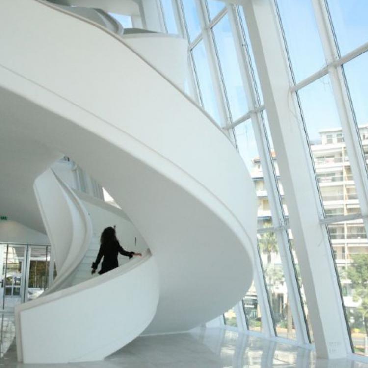
Another issue is that of spatial volume; what it is about the volume of an internal space that is deemed so valuable and important to communicate? It's more often a space feeling cramped is the problem. Spaces always feel bigger in reality so why fight to represent them in images by standing as far back in the corner as you can go to see all 4 walls? That's not what an architectural photographer would do, it's what an estate agent would do! We don't solely want to illustrate volume, we want to communicate design, architecture, light, colour, texture and space, but it's a fine balance and you may need 2 or 3 images to do that really effectively.

Architectural photographers don't just take 1 shot they shoot many and select maybe 20 or 30 that demonstrate their understanding and feel for a building and it's context. I believe great photography is about simplicity, and if you look at the likes of Hufton and Crow or Tim Griffiths, you can easily tell what the purpose of each shot is trying to do. What you're unlikely to find are shots that try and tell stories that are too complex.
If we take the analogy of a talented chef creating a wonderful menu from great ingredients, with courses that are designed to work beautifully together. We'd no doubt find an interesting and wide range of flavours, some bold and dominant some more subtle and delicate. It would be foolish to blend everything together into one easy to digest single course. At best this would produce a confusing array of flavours, and at worst would be unpalatable. It is much better instead is to build the taste experience by combining 2 or 3 of these flavours at once; each flavour still distinguishable but there's extra reward from the combination of flavours!
It's the same with imagery: identify and illustrate 2 or 3 key components that work together, and - because we're not trying to do too much - they can deliver strong composition and ultimately a memorable image.

Jon Hey
08 February 2014