Notice anything different round here? That's right, we have rebranded.
We've taken a look at our positioning, our core services, and our philosophy to refine our offer, raise our game, and add clarity about the level of craft and expertise you can expect from us. We've then refreshed and redesigned the visual expression of our brand to support and represent the evolution of our agency.
Welcome to our new look neighbourhood.
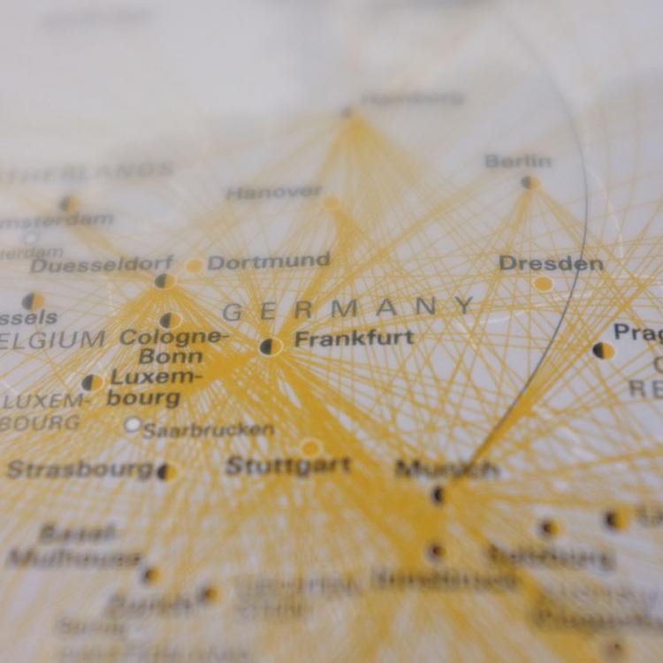
We're fascinated by the natural connections people form with places; the physical and digital destinations of our lives. Our cities are evolving, as is digital technology, and this is transforming how people live, work, play, and interact. These are exciting times, and we want to explore them with you.
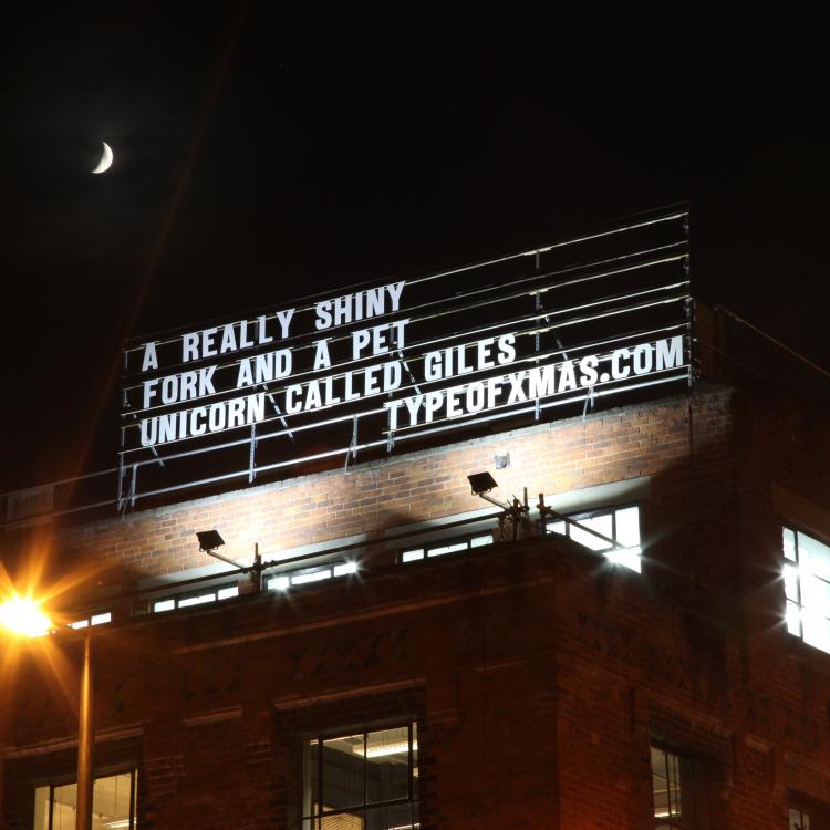
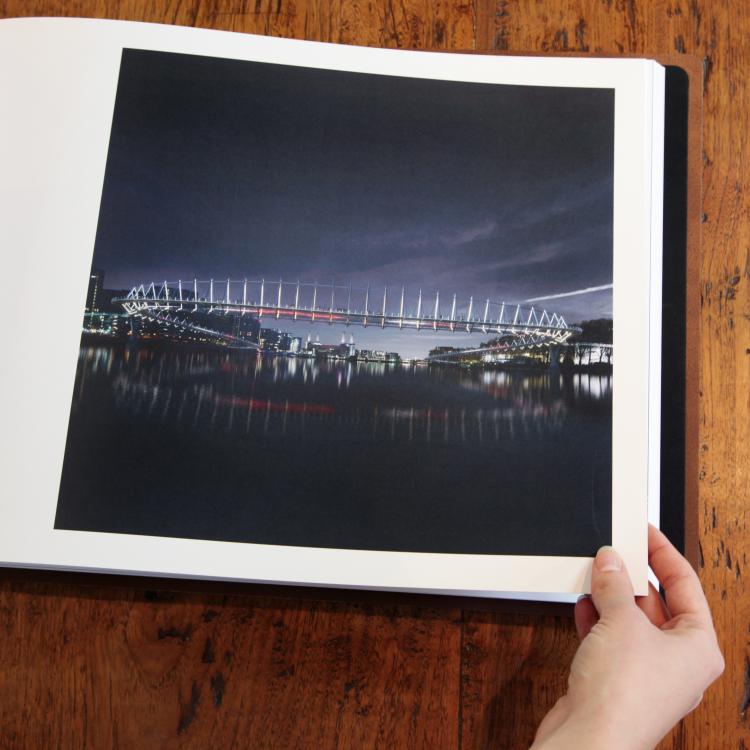
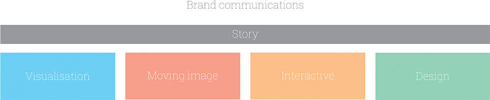
Our speciality is connecting people to a sense of place through engaging brand stories that influence the way people think and transform the way they feel. These stories are brought to life across 4 core pillars: visualisation, moving image, interactive, and design.
Our refined brand personality and identity embodies the six core values that inform and guide everything we do:
SIMPLE | Clear, common sense, uncomplicated
HUMAN | Interested in people, social, warm
EVOCATIVE | Intriguing, imaginative, expressive
PLAYFUL | Spirited, exploratory, fun
EXPERT | Insightful, experienced, articulate
PIONEERING | Progressive, inventive, leading
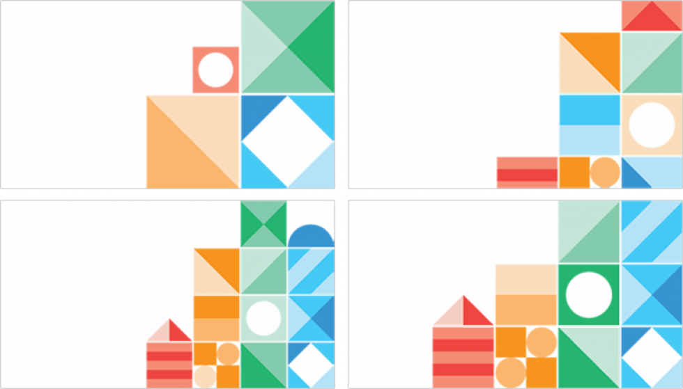
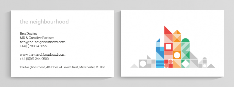
We have designed a flexible identity that represents the 4 cornerstones of our multidisciplinary agency, with the flexibility to accommodate future evolution. This is embodied in a graphic system of building blocks; an architecture of 4 colour-coded pillars that define our neighbourhood.
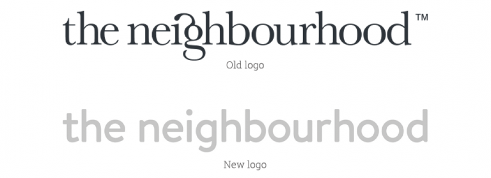
Our original word mark has been with us from day one, and its classic Baskerville type and custom ligature has been a cherished brand asset in the agency. However, it was time to revisit the design and create something more closely aligned to the direction of our agency. Our new word mark is set in a tweaked version of Brandon; a typeface whose clean and classic shapes allow clear legibility at all scales, and add consistency across our collateral.
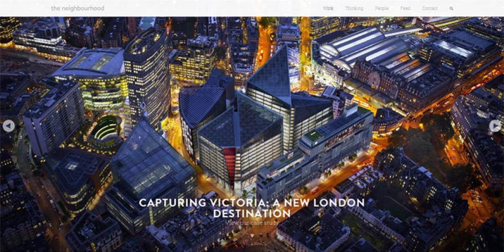
Simplicity and clarity runs across the thinking behind the redesign of our site. A 'less is more' approach with a greater use of white space gives our content space to breathe, and greater legibility across devices. We've then used full bleed image marquees to head up all our content, putting work and bold imagery centre stage for greater visual impact.
We recognise that everyone who comes to our site is a unique individual with different needs, and we wanted to make it easier for you to get right to the content you're after. So we asked your thoughts, listened intently, and built a new brand experience around what you folks, our clients, are looking for.
We've made it simpler for you to navigate to the sweet spots, like projects and case studies. We've added a thinking section to share industry insight, ideas, and inspiration. And we've created a quickfire feed, so you can get to know the people behind our place. We've also added marquee driven browsing and a related content feature, so if you have a bit of extra time, you can hop through the site and connect the dots to different places of interest.
Please roam free, explore, and tell us what you think @neighbourhood.
You can also read more about how we work and how a placemaking philosophy informs our approach.
Michelle Collier
27 March 2014